Spotify is notorious for celebrating the music, podcasts, and audiobooks that soundtracks the world through its iconic recap feature, Spotify Wrapped. Spotify Wrapped is an annual campaign that implements a year’s worth of streaming data to provide an interactive summary of a user’s Spotify journey. Users can navigate through this custom slideshow to gain insights on their streaming habits and preferences, from how much time they spent streaming on Spotify to their top songs and artists. Spotify also generates Wrapped playlists for users to keep a piece of their time capsule to refer back to.
As an avid music connoisseur and loyal Spotify streamer, I always look forward to Spotify Wrapped release days because I feel like I gain a better understanding of my identity and emotions at a certain point in time. After all, the girl who once had Kanye West as her top artist of 2021 was such a different person in 2023 when Lana Del Rey took over the throne. But how does the narrative change when we analyze the streaming data from a shorter timeframe?
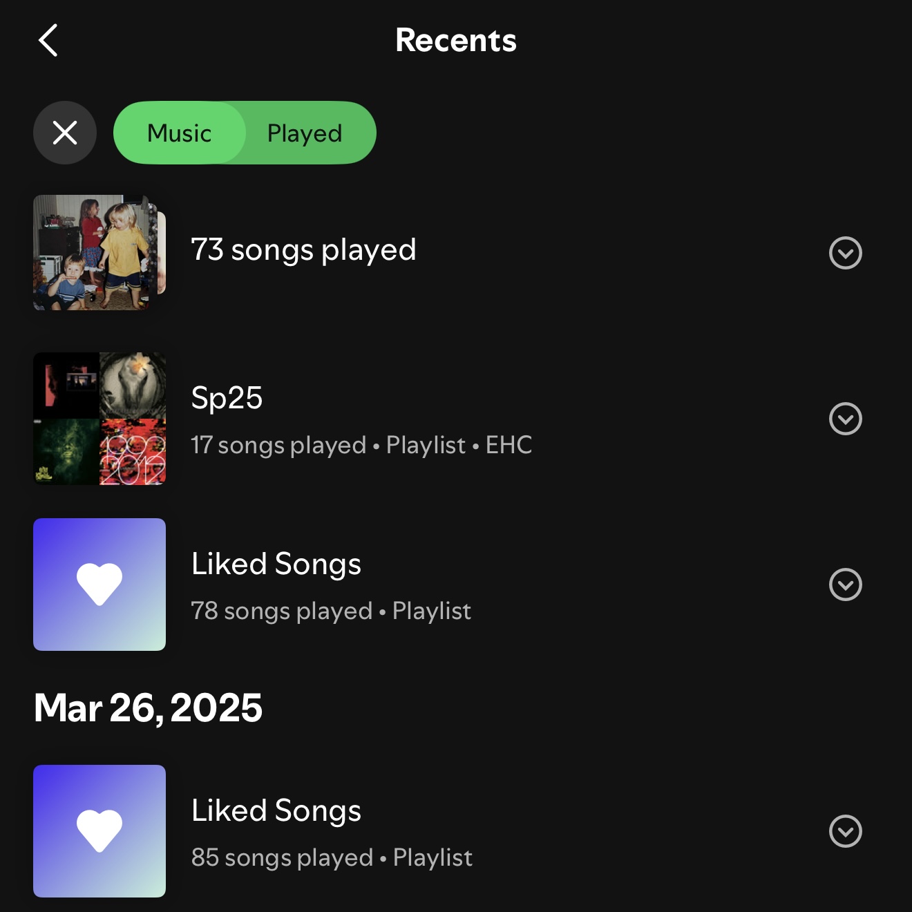
For my second data project on the quantified self, I collected and analyzed three weeks’ worth of Spotify data from March 26, 2025 to April 15, 2025 to get a glimpse of how much my current state in life played a role in my streaming activity. By working with a shorter dataset, my goal was to evaluate whether or not my spontaneous preferences resonated with me more than my pre-existing preferences. I asked myself the following questions to guide me as I created my visualizations:
- What patterns can I identify in the music I currently listen to?
- When have I been most active on Spotify?
- Why have I been streaming this way lately?
This project is dedicated to members of the Spotify community, streamers across all platforms, fellow music nerds, and most importantly, my constantly evolving self. Although this project was built around personal data, I encourage others to navigate through this analysis thinking about any spontaneous preferences they may notice in their streaming activity and how their everyday lives play a role in shaping them.
[ NOTE: Please view dashboards with display mode set to Desktop Layout. ]
Visualizations
Variables
- Streamed Artists: total streams, artists (group)
- Streams by Release Year: total tracks, release year
Introducing the first dashboard with icons representing my total streaming data. I can see my total streams, tracks, artists, and days streamed if I hover my mouse over each icon. To prevent duplicates for tracks and artists, I used a distinct count of tracks and created an artists group. My first impression of this three-week data was that I preferred listening to a variety of different songs and artists over listening to the same few artists and songs all the time. At first, I wanted to include a visualization of my top songs, but since I didn’t replay many tracks, it was hard clearly distinguish the songs that were played most frequently. Therefore, I researched my most streamed artists instead.
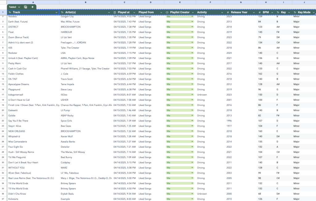
For Streamed Artists, I had to create a group of the artists string so that duplicated names were grouped. I only grouped artists if their name appeared multiple times as the first name in the artist column but were counted distinctly. This was helpful when grouping artists on songs with multiple credited artists. I wasn’t surprised that A$AP Rocky was my most streamed artist because he’s been one of my favorites for a long time — his music is timeless to me. Other highly streamed artists included Playboi Carti, Mac Miller, and Tyler, The Creator. I think I naturally ended up streaming lots of Carti after he dropped his new album in mid-March.
I also didn’t expect to have streamed the most music from 2023. I thought I would’ve had more ’90s and ’00s tunes after revisiting my old-school hip-hop obsession at the beginning of this year. But overall, it was pretty straightforward to visualize Streams by Release Year. I just had to be mindful of using total tracks instead of streams since I didn’t want replayed tracks to count as separate songs.
Ways to Improve: analyze how many artist streams were directly of my own versus a recommendation from Spotify, aggregate year of release data into decadal periods
Variables
- Daily Streams: total streams, streamed date
- Streams by Day of The Week: total streams, day of week (string)
In Daily Streams, I immediately noticed the gaps on the days I didn’t stream. I was surprised to see this gap at first knowing that I would never go a day without listening to music before graduating college. I realized that once I started working full-time, my music intake significantly decreased due to not being able to stream music at my own will. This was a hard truth for me to absorb, but I also accept that I missed a few days of streaming due to both circumstantial and personal factors (i.e. it’s a Saturday, I was listening to music on a different app, I didn’t have my AirPods with me on public transportation, etc.).
I think Streams by Day of The Week is an accurate representation of my current weekly streaming schedule. For example, I always drive down to my grandmother on Sundays to assist her with caretaking duties, and majority of the time I spend with her is accompanied by music playing in the background. However, Saturdays reported to be my least streamed days, and I assumed it’s because I don’t drive as much on those days.
Variables
- My Activity While Streaming: total streams, activity (group)
- Daily Streams (with Activity): total streams, streamed date (string), activity (group)
As I’d expected, My Activity While Streaming presents driving made up 87.5% of all activities reported while streaming. This feels like such a drastic difference from last year, where the majority of my streams took place while I was walking because it was my primary mode of transportation on campus. Other activities shown in this data include cooking, walking, and even looking at an art exhibition. There were a couple songs that counted as streams during times I wasn’t actively using Spotify, so I filtered them out from the rest of the dataset and applied it to all visualizations.
In Daily Streams (with Activity), we can see that driving took place for almost all the days streamed except for April 1st, 2025, which was on a Tuesday this year. Tuesdays are the one day I carpool to work with my mom instead of driving myself because I need to commute to NYC after work. Therefore, the majority of my streams from 4/1/25 occurred while partaking in a form of transportation other than driving, such as walking or public transportation. I used the activity (group) to aggregate walking activities (walking, walking dog) and public transportation methods (taking train into NYC, taking subway). Turns out Spotify makes great company when you have places to travel.
Ways to Improve: specifying activity more precisely when recording data to gain deeper insight on all the different times I open Spotify (i.e. driving to school, walking to library, getting ready for dinner, etc.)
Variables
- Streamed Keys: total tracks, key and key mode (calculated field)
- Streamed BPM: total tracks, BPM
My final dashboard displays visualizations of song keys and beats I streamed during the three weeks. The original intention for building this dashboard was to see what these features might suggest about my mood. I wanted to analyze how I was feeling based off my personal interpretations of the musical features, but it ended up becoming more like an assumption as I made the mistake of not recording my emotions in another column of the dataset.
My most Streamed Keys throughout the three weeks were B Minor, C# Minor, and F Minor. Coming from a music background, I found this data accurate knowing that I usually favored songs in minor key modes over major key modes. To me, songs in major keys easily sound more similar than those in minor keys since major chords work under one scale. Meanwhile, chords in minor keys can belong in three types of scales: natural minor, harmonic minor, and melodic minor. Because I prefer uniqueness and variation over repetition and familiarity, I naturally gravitate towards songs in minor keys.
My most Streamed BPM was 120, with the majority of streamed tracks ranging between 120 BPM and 140 BPM. For reference, this is the general tempo range for techno, one of my favorite genres of music. It’s possible to assume that techno was one of my top streamed genres in this dataset, but I also cannot rule out the fact that other genres can also fit into the 120-140 BPM range. Had I researched and logged the genre of each track, I would’ve had a better understanding of my musical aesthetic.
Ways to Improve: tracking mood in separate column of dataset, tracking genre in separate column of dataset
About the Data
- Track Artist(s): statsforspotify.com
- Played at: statsforspotify.com
- Date and Time
- Based on time a song finished playing
- Only songs that were played at least 30 seconds count as streams
- Played from: Spotify app (manual)
- Recents
- Playlist Creator: Spotify app (manual)
- Activity: Me (manual)
- I couldn’t record my activity in real time so I used the date and time a song was played to determine my activity while listening to the music. For example, a song played on a Monday morning meant I listened to it while driving to work.
- Activity group created in Tableau
- Filter out Unknown activity on all sheets to
- Release Year: Spotify (manual)
- BPM: Chordify, SongBPM, me (manual)
- Some BPMs were listed as half-time or double-time tempos so I looked up and listened to those songs to see which tempo type matched the track’s down beats.
- Key: Chordify, SongBPM, me (manual)
- Created calculated field in Tableau combining with Key Mode string
- Had to create group to compensate for typos (i.e. ‘A3’ Major will be grouped with A Major)
- Many songs were not listed with correct keys, so I had to look up, listen to, and sing scales as songs played to match their keys.
- Key Mode: Chordify, SongBPM, me (manual)
- Created calculated field in Tableau combining with Key string
- Had to create group to compensate for typos (i.e. F ‘Minior’ will be grouped with F Minor)
- Many songs were not listed with correct keys, so I had to look up, listen to, and sing scales as songs played to match their keys.


I didn’t end up working with playlist data as I prioritized other dashboards, but I think that using the data would’ve helped me make sense of how I might’ve felt during the three week streaming period. All in all, there’s so much flexibility in working with Spotify data that I hope to come back to this project to design more dashboards.
Takeaways
Using my Spotify data to explore the different patterns within my streaming history opened my eyes to the variety of stories that can be told based off my Spotify data. While consolidating all this data into one sheet was the most challenging part of the project design process, I’m grateful that I got a well-rounded idea of both my spontaneous preferences and ongoing general preferences through extracting data from a smaller date range. If I were to make any changes to this project, I would most likely use data directly provided by Spotify so that I have access to Spotify API variables without having to manually look up and input them into a sheet. I think it would be cool to see what other stories form based on these variables, such as stream skips, track danceability, and Spotify genres.
I look forward to seeing how the three weeks’ data contributes towards my Spotify Wrapped at the end of 2025. Hopefully, I remember to return to this post with updates on how the three-weeks’ data compares to the whole year’s data.

This entry is licensed under a Creative Commons Attribution-NonCommercial-ShareAlike 4.0 International license.